
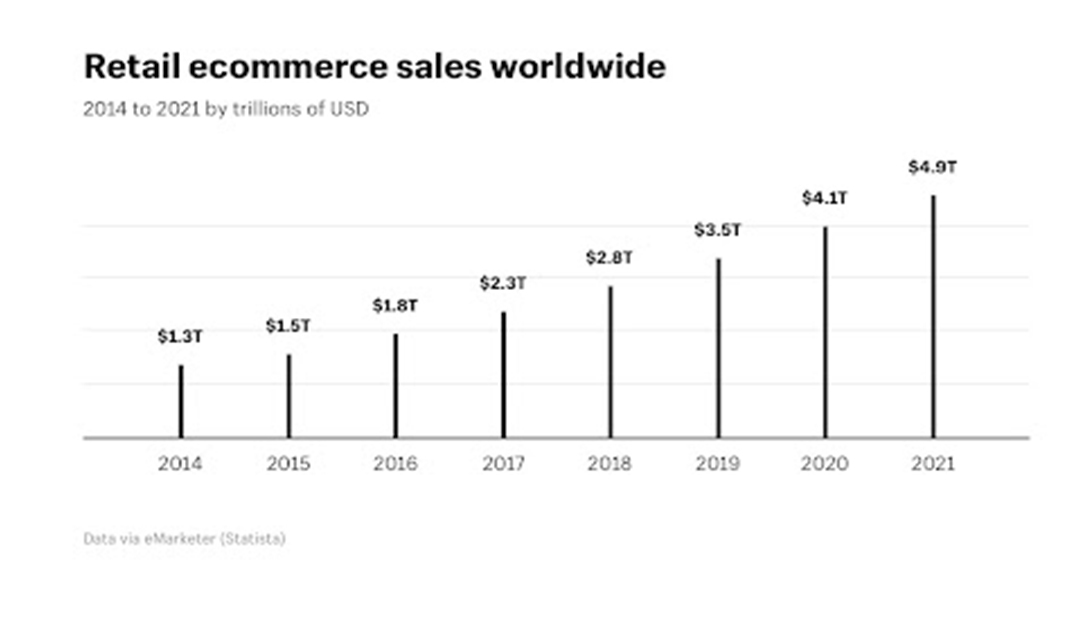
After social networking applications, eCommerce mobile apps are our second favourite rendezvous. We now purchase anything from prom dresses to spicy chili sauce through eCommerce, or should we say m-commerce, mobile apps. We can estimate the size of the worldwide eCommerce industry by looking around us and in our daily lives. According to various credible sources, here’s a staggering prediction: by 2021, the worldwide e-commerce market will have surpassed the 4.5 trillion USD level. The figures show that the e-commerce industry is growing in several directions.
Page Design for an eCommerce Product
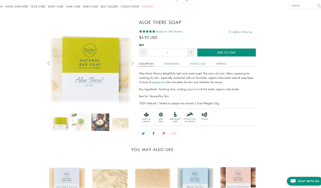
When customers locate the product, they desire, allow them to learn more about it for an excellent eCommerce UX. Create a product page that is as close to an in-person shopping experience as possible by having a lot of photographs, extensive descriptions, and any other relevant and valuable information. Look at what this entails in further detail.
-
Make Excellent Product Images
Customers who purchase online cannot touch, feel, or test out the merchandise. Instead, everything is determined by what they view on the internet. This is why it’s crucial to provide product photographs that clearly show all of the product’s features. A checklist for great product photos is as follows:
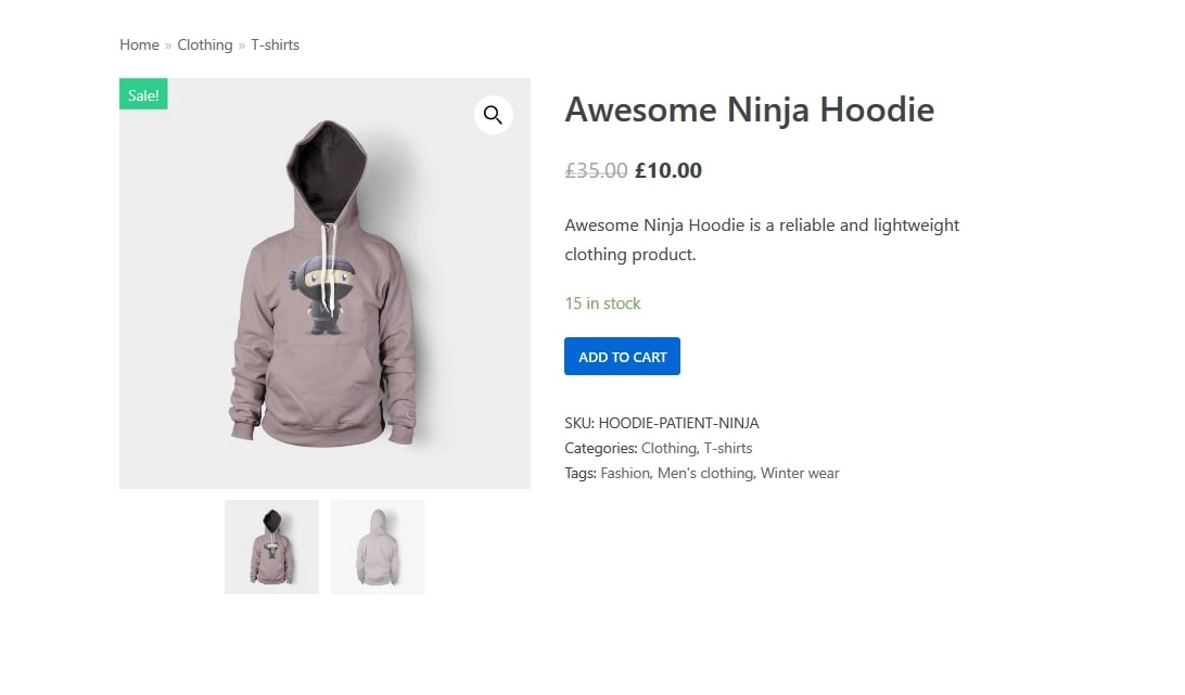
- Make the background white: The background for product photographs should not detract from or contradict the product. A white backdrop is ideal since it highlights the goods and complements practically any design or color palette.
- Use huge, high-quality photos:. Images that sell the goods are important. High-resolution photos pique customers’ curiosity and show them exactly what they’re getting. Large images allow customers to zoom in and inspect a product in more detail.
- Various photos should be used: To give a more thorough feel of the product, show it from multiple perspectives and include close-up shots. A 360-degree view with the ability to move the goods around is an excellent approach to simulate coming inside the store and interacting with it. The next step in this journey is virtual reality commerce.
- Incorporate video into your strategy. Videos may convey a lot of information in a short period. Use a video to demonstrate how the product works and offer as much information as feasible.
Maintain a regular schedule. Use consistent photos across different pages and match the website’s overall appearance and feel. Everything will appear neat. The main product picture should remain consistent across the website, including product highlights and highlighted goods.
2. Give Just Enough Product Details
Give customers thorough product information so they can make an educated purchase. Show availability, measurements, a sizing chart, materials used, total cost, guarantees, etc. The fewer questions people have about a product, the more probable they will buy it.
3. Make use of persuasion design.
According to the scarcity principle, humans appreciate rare objects more than plentiful ones. Show scarcity in the sales process by displaying how many goods are remaining, greying out out-of-stock sizes, or displaying sale dates. Potential purchasers will be motivated to act by scarcity. Companies are increasingly turning what used to be an art into science by employing advanced psychological research to increase engagement and purchases. In eCommerce, persuasive design is a powerful tool for increasing sales.
4. Show Products That Are Related or Recommended
Show related goods that customers might like and complement the present product or things others have bought. This may be shown on a product detail page or in the shopping cart to assist consumers in finding goods that fit their needs, thereby motivating them to keep browsing—a wonderful method to cross-sell related products.
5. Cart Design
The shopping cart is critical since it is where customers analyse their chosen goods, make final decisions, and check out. The shopping cart’s main objective is to direct customers to the checkout. Here are some suggestions for creating a user-friendly shopping cart that will inspire customers to make more purchases.
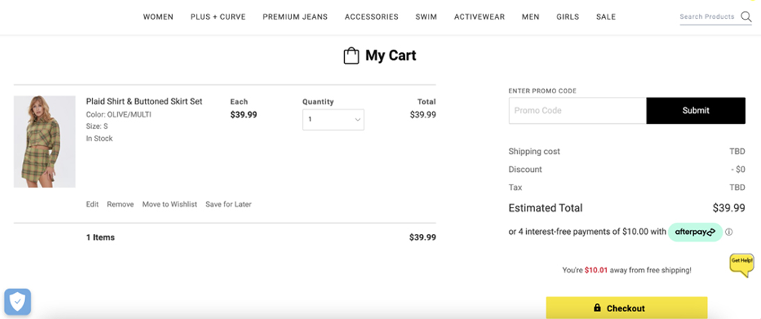
- Use a strong call to action (CTA). The checkout button should be the main call to action on the shopping cart page. Make the checkout button prominent, straightforward, and quick to use with bright colours, plenty of clickable locations, and plain text.
- Provide good feedback. As soon as a product is put into the shopping basket, verify it. Inadequate feedback, such as providing hidden confirmation text, might perplex customers. Animations are an excellent concept since movement fascinates the human eye.
- Make use of a mini-cart widget. A tiny cart allows customers to add items to their cart without leaving the page they’re on. They can also browse, find, and add new goods. Mini cart widgets should always direct visitors to the full-page shopping cart.
- Product information is displayed. Product names, photos, sizes, colours, and prices are shown in the shopping basket to assist consumers in remembering and comparing goods. Backlink goods in the basket to their complete product pages so customers may get additional information when they need it.
- Allow easy editing of the cart. It should be simple to delete, save, or edit information such as size, colour, or number.
- Avoid being surprised by shipping and tax charges. One of the most common causes for customers abandoning their carts is unexpected delivery expenses. Include shipping choices and taxes, as well as the estimated delivery date, in your order.
6. Checkout Design for E-Commerce
A fashionable design does not guarantee a good eCommerce site or an excellent user experience. Only the number of completed purchases is used to gauge eCommerce performance. Here are a few ideas for designing an effective checkout page:
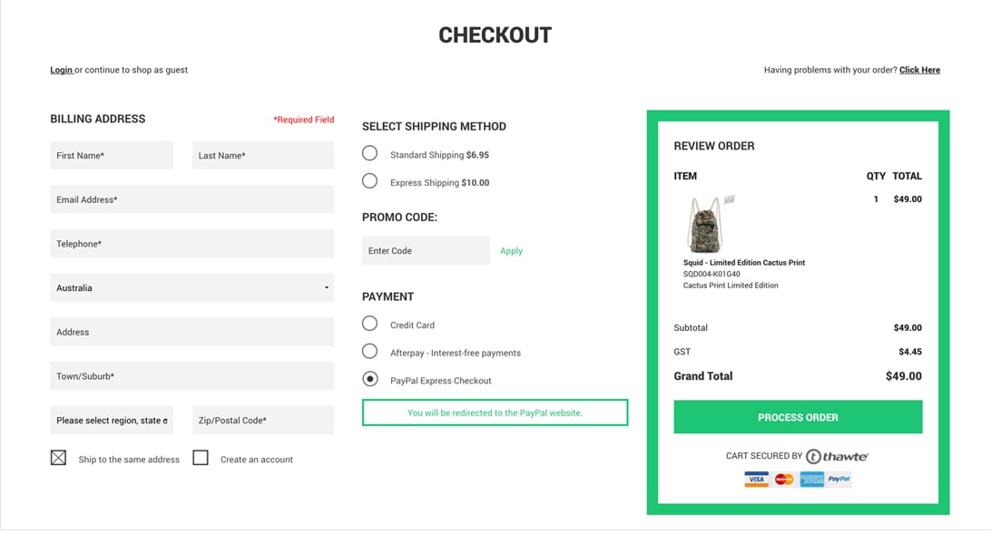
- Provide several payment methods. When it comes to payment methods, various buyers have varied preferences. To extend your consumer base and make it easier for shoppers to finish their orders, accept as many payment choices as feasible (depending on your target population).
- Maintain a straightforward approach. To finish the transaction, reduce the number of forms and stages. Designing a one-page checkout where customers can view their basket and enter delivery and payment details is great.
- Make registration voluntary. Forcing customers to register an account before making their first purchase will turn them away. Allow customers to register once they’ve completed their investment, and emphasize the benefits of registering while encouraging them. Faster checkout owing to preserved personal information like delivery address or payment information and access to special deals accessible only to registered users.
- Use obvious error messages. Nothing is more aggravating than being unable to make a purchase or figuring out why. Make error messages appear in real-time rather than after a form is submitted. Put clear and succinct error notices above or next to the item that needs to be fixed so that customers see and understand them.
- Maintain focus. Include a progress indicator when utilising a multi-page checkout to display how many more steps are required to finish the transaction. This removes any uncertainty and assures customers that they are on the correct route. Show an order confirmation and order status with shipping tracking after the complete transaction.
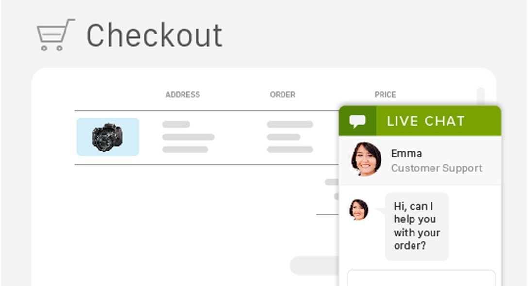
- Encourage them. Include a live chat option or a phone number during the checkout process so that customers may receive answers without leaving the site.
Integration of technologies to improve the shopping experience
Even if your software covers the essentials, success is not guaranteed. Many businesses fail because they don’t understand how their customers buy. Keeping current with various techniques can go a long way toward closing the gap:
1. AR/VR
Integrating various augmented reality elements into your eCommerce mobile app may drastically improve how shoppers perceive and purchase your products. Because your items will be shown in 3D, you may establish a virtual showroom where buyers can use a selfie to try on spectacles, apparel, or any cosmetic thing, or point the camera at a certain furniture piece to see how it would appear in their living room.
2. In-app purchases with a single click
A one-click transaction can help you avoid cart abandonment. Amazon was the first to include this functionality in its app. This technique, however, is quite simple to deploy. It allows customers to buy things right on the product page without putting them in their basket and then proceed to the checkout procedure.
3. Social media tagging of products
Imagine being able to click on a snapshot of a pair of sunglasses you see on Instagram and having your phone take you straight to the product page. You may not only direct customers to your product sites but also propose more things based on their social media interests. Once again, AI is leading the way in this field.
Conclusion
No matter what, online customers demand seamless experiences. When developing an eCommerce site, the goal is to create an online purchasing experience that will convert casual visitors into paying consumers. Hopefully, this eCommerce website design guide will assist you in making critical design decisions that will result in a fantastic eCommerce UX that is professional, appealing, user-friendly, and encourages customers to return for more. Fast growth combined with a low market share means there is still room for new businesses to catch up to industry giants.


Leave a Reply